Creating Accessible Learning Materials
Every student is different and as teachers and writers we embrace their diversity and support their learning. The UK Equality Act 2010 has nine protected characteristics; age, race, gender, disability, marriage and civil partnership, pregnancy and maternity, religion or belief, sexual orientation and gender reassignment. I feel privileged to live in a country that legislates to ensure these characteristics are protected under law. In this blog post, I will outline how to create print and digital materials which are accessible to all.
Protected charactersistics of the UK Equality Act 2010. Quick visuals by Emily Bryson.
I will start with disability, as the needs of students with Specific Learning Differences such as dyslexia or colour blindness can be met by making simple changes in regards to layout and font.
Font choice
In terms of font choice, serif fonts, for example Times New Roman, Baskerville and Bookman, are considered less accessible as some people find them difficult to read. This is because serif fonts have little ‘flicks’ or ‘tails’ which can be distracting to readers. I apologise that this post is in a serif font! WordPress only seems to offer one option.
Sans serif fonts are more accessible.

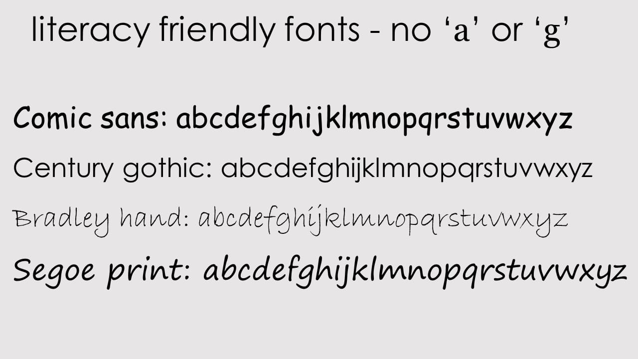
Sans serif fonts (e.g. Arial, Calibri and Trebuchet) are generally considered the most accessible choice but you could also download dyslexia friendly fonts. The British Dyslexia Association recommends Comic Sans or Arial. If you teach adult literacy learners, you may also wish to use Comic Sans or Century Gothic as these are most similar to handwritten text, and don’t include ‘a’ and ‘g’, which can confuse learners. Sassoon font is also great for literacy learners, but you need a licence.
Choose fonts similar to handwriting when teaching literacy learners.
Font size
As an observer for teacher training courses, I often see trainees using fonts which are too small in their presentation slides. This is also often the case with books and published worksheets. When creating your own print materials aim for font size 12 as minimum. For presentations, 24 point font is the minimum with 36 or 44 being the recommended size. This also helps to keep the number of words on a slide to a minimum. No one likes a busy presentation slide – less is more!
For online learning, bear in mind that students may be accessing content on their mobiles, and they can’t always zoom in. If you present online using the editing view in powerpoint, aim to use font size 50 or above. If you make videos using powerpoint, aim for font size 40 or above.
Make sure your font size is large enough for mobile learning.

Adding emphasis
Drawing attention to certain language points, content or rubrics in an accessible way should be considered carefully. Underlining can make things harder to read, while the slope of italics can also make reading large blocks of text problematic. BLOCK CAPITALS CAN ALSO PROVE CHALLENGING AS ALL THE LETTERS ARE THE SAME SIZE.
Bold is by far the most accessible method of adding emphasis. That’s not to say NEVER use block capitals, italics or underlines. These are all perfectly fine to add emphasis in short sentences, questions, headings or rubrics but should be avoided as the main body of a text. I tend to avoid using capitals for emphasis with literacy learners too, as this can confuse their understanding of capitalisation rules.
Using colour
The number one rule of using colour is never to rely solely on colour to convey meaning. Colour blind learners may not be able to see any difference in the colours or shades that you chose. Instead, circle, use arrows, bold or texture – and keep it simple.
Some colour combinations are difficult to read (avoid green and red/pink). Use a light, off-white, single colour background and dark, contrasting lettering. I tend to play safe and use minimal colours and good old dark grey or black letters.
When it comes to being inclusive to other protected characteristics, image selection plays a huge role. Select images which show people with protected characteristics in a positive light and represent each frequently within your materials so that they are normalised rather than sensationalised. For example, use a text about a female engineer who is a wheelchair user, a male midwife or a young boy whose parental guardians are his grandparents. Focus on the person and the story surrounding the person rather than their protected characteristic. Their protected characteristic is not their story, nor their reason for being ‘inspiring’ . This way they are represented and included without being highlighted as different or unique.
In many countries, it can be challenging to include people who identify as LGBT+ within materials, but there are ways to do so subtly. For example, you could have a dialogue about two men living together and leave their reason for doing so open to interpretation. In the same way, a text message conversation between two women regarding childcare arrangements could be between friends, sisters or partners. You could also consider using gender neutral names – for example Sam and Alex being in a relationship.
One important characteristic in ELT, that isn’t in the Equality Act 2010, is first language. I guess it could fit in the race characteristic but in terms of ELT I think it’s important to protect ‘non-native English speakers’ from native speakerism. Try to include opportunities within your materials to explore global English, reflect on when, where and how learners use their English and the nuances of accent choice.
Use graphic facilitation techniques
One of the best ways to make learning accessible is by drawing! A simple drawing can help make rubrics clearer, check understanding and ensure classroom communication is clear. A whiteboard full of text could be overwhelming, but add some simple drawings and it becomes an engaging, supportive memory aid.
Creating graphic organisers and sketchnotes for your classes (or helping them create their own) can reduce processing load and help learners to focus and reflect. Find out more by taking one of my courses!
Further reading
This blog post only touches the surface of accessibility. For more information, I recommend the following:
- Reading Jon Hird’s MaWSIG blog post and Video with John Hird on Writing ELT materials for learners with dyslexia.
- UK Government advice has some excellent infographics about accessibility and advice on using inclusive person centred language.
- Checking out the ELT Well site for training courses and support materials for learners with SpLDs.
- Downloading the FREE ESOL Intimate Migrations Toolkit which has fantastic classroom resources for promoting equality, diversity and LGBT+ matters.
- James M. Taylor and Ila Coimbra’s diverse and inclusive course books Raise Up.
- The Plain English campaign.
- Inclusive (and free) stock photos: The Gender Spectrum Collection (LGBT), Nappy.co (POC), Women in Tech, Ageing Better and DisabilityIN.
- My other blogs posts.
What do you do to make sure your classes and learning materials are accessible? Do you have any favourite resources or sites? I’d love to hear from you.
If you’d like to find out more about using graphic facilitation to make learning accessible. Check out my courses! Click the laptop icon for more info!

Leave a Comment
🪄 Visual Sparkle for English Language Learning & Teaching 🪄
Copyright © 2025 Emily Bryson ELT


